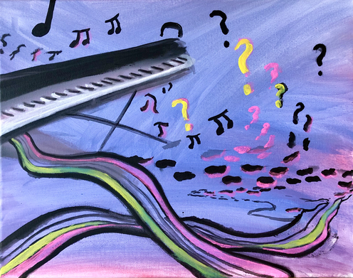
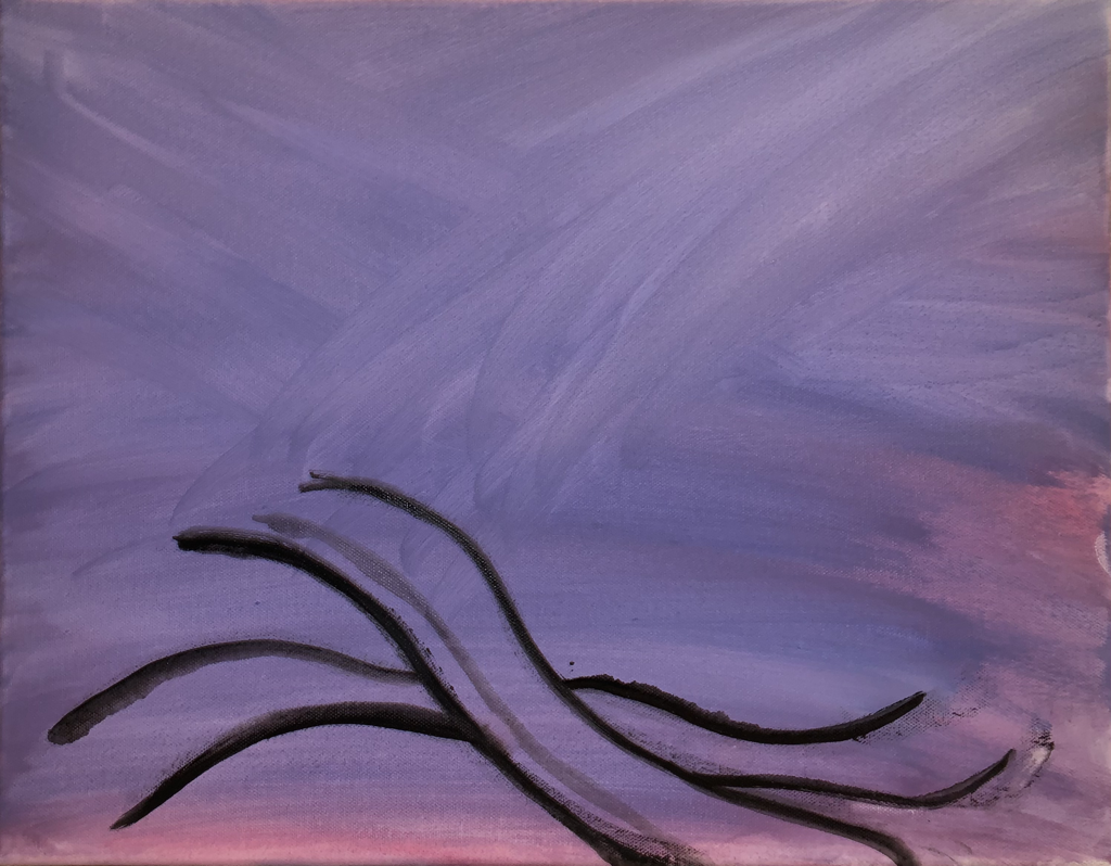
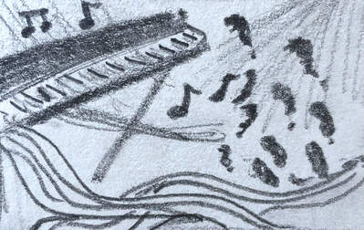
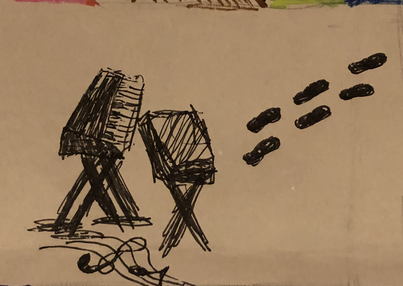
RecapitulationIn-Progress PhotosPhotograph of a roller-skating rink scene edited with software on my iPhone to repeat details of the image and adjust colors. The title relates to this piece as the skates and repeating details convey perseverance through failures as I desire to achieve my dreams & goals. I must continue to strive towards success and work hard, but this may require me to practice for a long time, and I may have to ‘fall down and get back up’, like one does when roller skating. The fact that I took this photograph on New Years’ Eve also relates to the title as I come to the brink of a new year in my life that will bring new opportunities and wisdom so that I may have the inspiration to change my mindset and achieve my dreams.
I began this piece by choosing a photo from my iPhone camera roll that I had taken on New Year's Eve of 2018, as 2019 began. Although I had shared this photo before on my blog, I thought I could incorporate this photograph into my concentration for AP 2-D Art and make the photo more interesting by using some photoshop/superimpose techniques. To begin the editing process of this photo, I imported the original photo (which I had previously altered the colors and saturation of) into superimpose on my iPhone and made the foreground and background the same photo, but I used the background to extend the width of the image. To do this, I repeated certain details of the image on the left side of the image, and added features that were already repeated in the original photo to the upper left side of the new image. I then worked at blending each segment of the original photo together in the new version of this photo, adding light fixtures and people on the background repeatedly with slightly different colors. After superimposing fragments and blending everything together, I felt that this piece was entirely complete, but I wondered if I should somewhat crop the bottom of the image to make the audience more attentive to the neon lights and roller skates. So, I asked my classmates and teacher for their opinion, and decided to partially crop the bottom 1/8 of the image, to get rid of some of the black on the bottom, which couldn't be easily deciphered as any particular detail or object due to the lighting. As I reflect on my process and the final piece now, I think that partially cropping the bottom was a nice choice, but I still like the way that both the cropped and uncrossed versions look.
0 Comments
Fear of FailureIn-Progress PhotosReference PhotosReflection Digital piece composed of a photo of myself writing on a piece of paper, along with images of skies, water, and a boat figurine. The cool-tones in this piece correspond with piece #1 & #8 as the instance conveyed in this piece involves fear and stress. The tilt of the boat, water, and sky aids the illusion of my hands controlling the situation as if I am ‘steering the boat’ of my life, yet the pressure my pencil places on the boat (the pressure I and others place on myself), causes the boat to sink (places stress on myself and fuels the continuation of my fear to achieve my goals).
I began this piece by selecting a photo of waves from lake water that I had taken on my iPhone months prior and importing such into superimpose on my iPhone. I then tilted the horizontal axis of this photo to make the water look more dramatic. After adding this, I felt I immediately needed to add a sky if I had water, so I took another photo from my iPhone and superimposed it into the image. After creating this setting, I felt that I should add a boat, but the problem was that I didn't have any photos of a boat on my iPhone nor my Canon Rebel camera, so I resorted to a boat figurine that my dad placed in his bedroom, and I took a few photos of this boat to figure out which composition I liked the best. Once I picked which composition I liked the best for the boat, I superimposed this image into the water and sky that I had already merged together and removed the original background of the boat photo to place it in the best position. With the scene starting to come together, I felt that I needed to make this piece more interesting and coherent, so I edited the foreground (the boat) and the background (the sky and waves) colors to share more of a blue color scheme. After creating what I thought was my final piece, I thought more about the metaphorical meaning of this piece while coming across a random photo in my iPhone camera roll that was of me writing on a piece of paper at school while in class. DaydreamIn-Progress PhotosReference PhotosReflectionDigital piece created by editing together photos with various color schemes and textures. The abundance of intricate detail and color placed in a somewhat unnatural way in this piece creates a scene that expresses how some vivid dreams are formed spontaneously. The purpose of this piece was not to convey a specific emotion or realization I dwell on in my dreams or goals in life, but rather to show how intricate dreams can be, and how that is fascinating to me. I can recall some dreams to be so detailed and stimulating to my emotions, yet they make little sense.
The Beauty of ExplicationIn-Progress PhotosOriginal Photo |
Graphite Sketch | Pen & Ink Sketch |
Reflection
I began this painting in a different manner of my first piece, I didn't have a vivid recollection of a dream that I had for inspiration. Instead, I wanted to convey the idea of being passionate about a certain activity, to the point where you have an inner-conflict to decide whether or not pursuing such passion should be your life-long career. I wanted this conflict to be illustrated in a way that was dream-like (as in making the painting feel slightly abstract, with bright colors and unnatural phenomena). I first made a digital sketch on my phone, but then created two more quick sketches on paper to change the composition of the piano. After finishing these simple sketches, I felt stuck as I couldn't figure out what else to plan for this piece, so I just began painting on my canvas.
I started out by applying pink and purple acrylic paint to the canvas in random strokes to experiment with the lighting layout of this piece. I then began to add a curvy, musical staff and began to draw the lines within such staff. Next, I placed a slanted piano on the left side of the canvas, attempting to give the piano depth. With the piano and staff now on the canvas, I began to place irregular lines, transitioning into musical notes in a "path". I soon realized that I needed to take a break to decide where I wanted this "path" to lead, what colors I should add, and what should the foreground and background include. I then resumed by adding pink and yellow highlights/outlines to some of the musical notes and irregular lines, but this felt odd, so spontaneously began painting with blue all over the "open space" on the canvas. This blue paint, now on the canvas, gave me the idea to make the foreground a body of water, and to incorporate elements that would be found in nature.
I continued painting in blue, eventually adding a faint shape of a waterfall, and then decided I would add a mountain-like, slanted landform off of the waterfall. I put some pink paints on my brushes and just painted with whatever colors felt right in the moment, until I realized that could specifically use a fan brush and create interesting textures. I began to paint rapidly with this brush, pulling from all colors on the color wheel; this was when I began to enjoy the look and feeling of this piece. I added a second staff above the piano, illustrating it in a way as if the staff lines were vines or the branches of a fictional, overgrown tree. I continued to add all types of colors (i.e. yellows, teal, greens, pinks, whites, reds, blues, purples, browns) with the fan brush, stopping once I felt it was reading to re-paint the color of the staff above the piano to make it stand out more. I concluded my painting process by adding additional branches/staff lines spouting off of the two staffs in the foreground, and added a few faint musical notes in the fashion of tree branches.
Now that this piece is done, I am very pleased with how its look evolved. Originally, I though that this would be a very minimalistic yet still meaningful piece. Instead, it became one of an abundance of natural elements and color. Although I am satisfied overall, I plan on revising this piece to add bit more detail (i.e. flowers) to the surface of the piano and some of the staff lines, to accentuate the feeling of this piece.
When Should I Get Off?
In-Progress Photos
Sketches
Reflection
I began this painting with inspiration from a dream that I had that made me feel unprotected, confused, anxious, and scared; a dream where I was in a tundra-like biome with many mountains and a dangerous, whitewater rapid river. In my dream, I was floating down the treacherous body of water with a few other people, but all of a sudden I was all alone and had nothing to cling to. I was afraid, feeling like I would never find the end of the river, nor would I find any people or safe spots to escape the water. My surroundings were huge, snowy mountains, therefore I felt an even greater sense of feeling trapped and in danger.
After remembering the imagery of this dream and how I felt, I began to sketch as quickly as possible, as I felt as if the image would escape my mind in a matter of seconds. After putting my sketch down on paper, I further visualized how I would manage to make my dream come to life and convey the same mood as such that I felt while dreaming. I immediately knew that I would want to include many mountains and a river, so I started to paint triangular, 2-D mountains on my canvas, with a river in the middle. I quickly saw that my mountains were not detailed enough, and didn't convey a feeling of being scared and intimidated, so I watched some YouTube videos of people painting mountains, and observed images of whitewater rapids and snowy mountain ranges. By doing this research online, I felt freer to paint my mountains and river with real-life inspiration for how I should depict my dream's landforms. As I continued to paint and tried to use greater detail, I took a break and went to Google Earth on my phone to view Mount Everest in Asia from a bird's eye view. By using Google Earth's 3-D satellite view, I was able to further understand reconstruct the mountains from the perspective that I wished.
After repeating my techniques of using small brushes, big brushes, and then white with a palette knife to create my mountains, I moved on to the river and began to add white and blues with a fan brush. After doing this, I reached a point where I felt like I could slow down my painting process and focus on the final details. I communicated with my classmates and teacher and received feedback that I agreed with- to add more value and deep blue to the river, clean up the edges of the mountains, and use a palette knife for more detail on the mountains. I followed this feedback and used these tips to finalize my piece.
After finishing my piece, I notice how I only use blues, with a mixture of white and black to make different hues. Usually, I would agree with my feedback in the sense of adding more colors (i.e. some purple, red, and pink) to make my piece more vibrant or abundant in color, but I actually like how my piece is color-wise. I think that only using the blues helps convey the intimidating, drowsy, dangerous setting of this dream. If I could have done anything differently, I would have possibly used oil paint instead of acrylic, because my paint dried very quickly and worked differently from oil paint when trying to use a palette knife to make certain textures. I also think that using oil paint instead of acrylic would have accentuated the anxiety and worry that one would feel if they were in this environment because I could have used the oil paint to make rocky, uneven textures in the mountains.
Details
Author
Hi there, I'm Ashley and I love all mediums in which I can express my fascinations and emotions. Whether it be painting, music production, apparel production, 3-D modeling, drawing, or writing, I just adore creativity's endless possibilities. I am currently taking Apparel Production II Honors and AP 3-D Art while I work with music production and 3-D modeling outside of class.