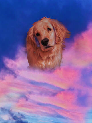
The place that is represented in my art is the sky, specifically, a place in the sky where my mind is able to be creative and create pictures of what it desires to.
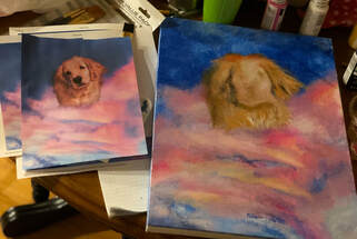
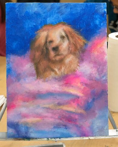
This place is significant, as it can not only relate to me, but can also be interpreted in a way where anyone who views this piece, will be able to relate it to themselves, hence making the piece more personal to everyone's emotions when they look at it, as it expresses mine at the same time. The most challenging about the photo that I took was that, since I took a photo of the sky, and then merged it in a flowing way, with the photo of my dog, this made it more difficult than expected, as I had to alter the way that I would paint the photo, to make it appear as although the dog shows some textures of fur, the piece is still displaying techniques that make it appear as if the dog was formed by clouds with abstract, bright colors. I feel that the most successful part of this piece of artwork was the fact that I partially changed the piece, to make the dog appear more practical in comparison to the cloud details and texture, as I wanted to achieve the slight idea that the painting could still be seen as simultaneous clouds, that miraculously formed this dog in the bright sky. This would not have been done if I had not further displayed my creativity, and altered the desired outcome, compared to the original photo, as I feel as if I had not done so, my dog would almost have been seen far too displaced in the scenery, not helping the interesting emphasis of my theme/IDEA of place, come to life. In the process of painting this piece, I started by painting my canvas with a base coat, which happened to be white, instead of black, as I had to paint on a canvas that had been previously been used, that Ms. Sudkamp gave to me. After the coats of the white acrylic paint had dried, I began using my photo as my reference, and started to paint the top corners of the sky with slightly watered-down blues, then fading into other colors that were necessary in certain areas. I ended up making a painting of the dog in the correct area of my canvas, as the sky was mostly completed. This painting of the dog ended up being my "draft" painting, as I went home one night and completely painted over the dog, adding in the correct, needed textures, values, hues, details, composition, etc. My piece completely transformed on this night in the presence of the peace and quiet in my house. When I returned to school the next day, all I had left to do, was over-lap certain colors on the clouds, to touch up, blend in shadows to make the dog feel as if it was meant to be in this beautiful sky, and add back some variants of colors that I had possibly painted over previously, and add colors that appeared more vibrant, helping my final piece come together. Now, after all of this, my piece had been completed, and I then became excited as I am still, longing to hang up this piece that is partially supposed to resemble my dog, Rosie, in my bedroom!
0 Comments
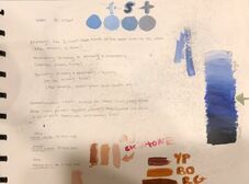
During these activities, I learned that, by knowing what different shades, tints, & tones look like, for different types of colors, & how to create these colors by mixing colors of paint, you can create pieces of art that actually look like they have the right depths, to display different textures, & bring more life to your piece of art.
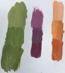
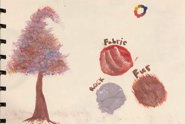
I feel that, out of all the tips & methods that Ms. Sudkamp taught us, the tips with stippling to help create different textures, for instance, bring trees to life, will be helpful in the making of my artwork, as I plan on painting something, that will consist of some nature elements, either of, or similar, to trees. I think that I gained the most new, significant information from Ms. Sudkamp, when she explained how to create different types of browns, as I had not been taught this before, but rather had just always experimented while painting, so, this will relieve a lot of obstacles, when painting pieces that include, or resemble nature, people, & animals. The following lists 3 ways, to make 3 different browns, by combining different paint colors *PURPLE (red & blue) + YELLOW * BLUE + ORANGE (red & yellow) *RED + GREEN (blue & yellow) You can tone down a color, by adding grey, to the pure hue. :):) |
 RSS Feed
